UX/UI Design, UX Research | Q1 2024
Challenge
Busy families and caregivers often need to coordinate their personal and professional obligations. It can be time consuming to sort through this information, especially during busy days with last minute changes.
Solution
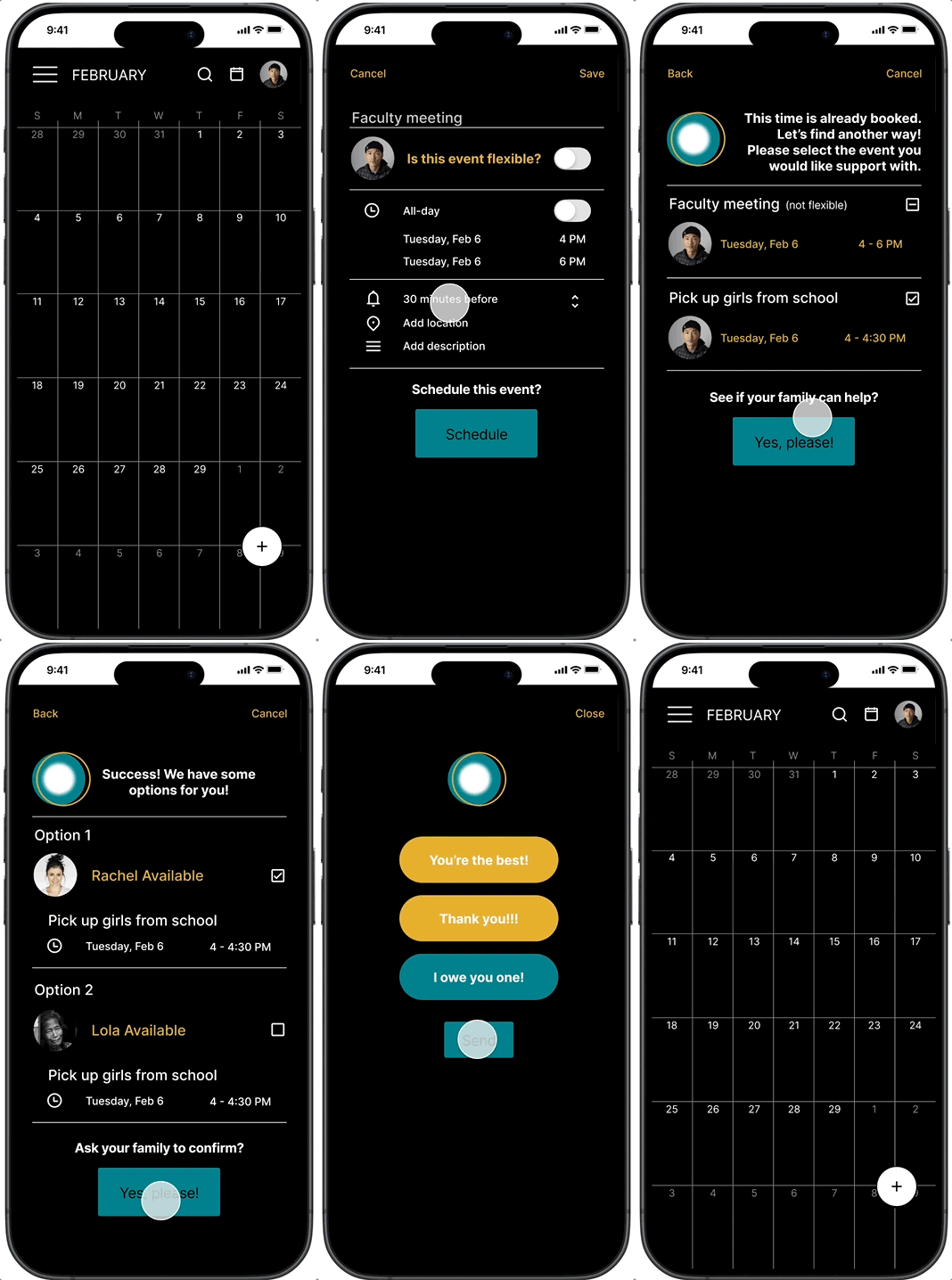
SyncUp is a mobile plugin for a calendar app that helps busy families and caregivers coordinate their schedules using the assistance of AI.
RESEARCH
We interviewed families from various backgrounds and different stages in their parenting journey. Each family had a busy schedule and a deep desire to get organized so they could maximize their time. We understood the value of organizing and coordinating schedules but overlooked the value of free time in between. A common request with the families we interviewed was a desire for more free time which we kept in mind as we proceeded.
USER PAIN POINTS
1) Task ownership: Many users find it difficult to track availability of ownership for a task shared between caregivers.
2) Schedule Conflicts: It can be challenging to have a high level overview of when scheduling conflicts occur. This makes it difficult to know when a conflict needs to be addressed.
3) Communication: Communicating who will take on a shared task due to scheduling conflicts can be difficult. Efficient communication when schedules overlap would be helpful.
4) Free Time: A common desire from users was identifying free time to enjoy their lives. Users would benefit from finding opportunities to make time beyond day to day priorities and obligations.
PROBLEM STATEMENT
Clement is a busy parent and partner who needs an efficient way to communicate and manage his family’s schedule because their schedules are constantly changing.
USER JOURNEY MAP
Thinking through a stressful situation was a great opportunity to think through how the user might want to express positive emotions such as gratitude or opportunities for how the user might want to bond with their partner.
PAPER WIREFRAMES
DIGITAL WIREFRAMES
INFORMATION ARCHITECTURE
LOFI PROTOTYPE
USABILITY STUDY FINDINGS
We observed 5 users of varying backgrounds and needs using our SyncUp plug-in for an existing calendar app.
1) Simplify: Users were overwhelmed by the amount of options provided. Breaking up the user flow provided a less chaotic experience.
2) Collaboration: Users wanted a better way to select a “family member” to collaborate with. Rather than choosing a “family member” to collaborate with, the app automatically populates the options with a “family member'“ that is available during the proposed event change.
3) Automate: Users needed a reminder during their experience of what events were not flexible. Conflicting events were added to the view to provide transparency to the user.
MOCKUP
HIFI PROTOTYPE
outcomes & learnings
While the user is able to complete the tasks in the plugin, the overall experience could be improved by adding animations and improved visual elements. Additionally, adding a feature for free time opportunities would benefit the user experience and their goals.


